King did not start out as a bestselling author in hardcover. Doubleday bought Carrie for $2,500 and it sold 13,000 copies. They sold 30,000 copies of ‘Salem’s Lot and about 50,000 copies of The Shining. Night Shift sold 24,000 copies. For King’s first five books they paid $77,500 in total advance money, or about $15,500 per book, and while his sales chart went reassuringly up and to the right there were plenty of other horror writers selling plenty more books.
But despite these low numbers, King made an impact early on, and that’s all down to one thing: the paperbacks. Starting with Carrie, New American Library, a paperback publisher, saw potential and offered him $400,000, approximately 160 times more than Doubleday paid for the book. Thanks to a terrible contract, Doubleday took half that money, but that’s still a lot of money. NAL paid King half a million for ‘Salem’s Lot and another half million for The Shining. And the books sold. 1.3 million copies of Carrie in nine months, 2.9 million over the next three years.
The difference between King’s constipated sales figures at Doubleday and his mudslide of sales at New American Library? Covers. Because paperback publishers knew covers.
When Jaws came out in hardcover in 1974 it sported a black cover with a swimmer floating in space and the blunt head of a static, streamlined shark poking up from the bottom of the jacket, like the blunt, rounded nose of a commercial airliner. The shark held its dainty, crescent mouth slightly agape and the whole design felt abstract and placid. The man responsible for it was the legendary Paul Bacon, considered the founder of the Big Book Look, which featured minimalist covers with the author’s name and the book’s title as the largest design elements (see also: Catch-22, One Flew Over the Cuckoo’s Nest, Rosemary’s Baby, Portnoy’s Complaint, all books designed by Bacon).
Jaws sold well but when Bantam picked it up for paperback their art director, Len Leone, wasn’t having it. He hired Roger Kastel, an artist ten years younger than Bacon, who took Bacon’s basic composition and added realism. Now the swimmer and the shark are closer, there’s actual sea-green water, the shark is charging up at the swimmer who seems to be thrashing through the water, and it’s got a giant, gaping mouth, wide open and full of jagged teeth the size of machetes, ready to shred some human flesh. It’s one of three covers Kastel turned out that same month, it’s dynamic, it’s iconic, and it became so popular Universal licensed it for the poster, and the t-shirts, and the beach towels, and the coffee mugs. And it sold a lot of paperbacks.
Before the ‘90s, art directors were the Don Drapers of Publishing. Their word was law. If they were in a red mood, all the covers on the publisher’s list that season would be red. If they saw a sketch of a cover they liked better than the finished art, then that sketch would be used on the cover (which is how Signet came up with their unique paperback covers for their Shakespeares).
At Doubleday the art director gave readers of the hardbacks a young woman peering at them (Carrie), a small drawing of a New England town (‘Salem’s Lot), a family looking dramatic (The Shining), no cover design at all (Night Shift), and an allegorical looking guy fighting an allegorical looking bird (The Stand).
Jim Plumieri, the art director over at NAL, called bullshit. He had a powerful, minimalist aesthetic and he wanted readers to engage with the book. First step, they see the cover and say “What the hell?” Second step, they pick it up. Now they have it in their hands, and you’re halfway to a sale. Third step, once it’s in their hands they can read the title, and the author, and all the boring words.
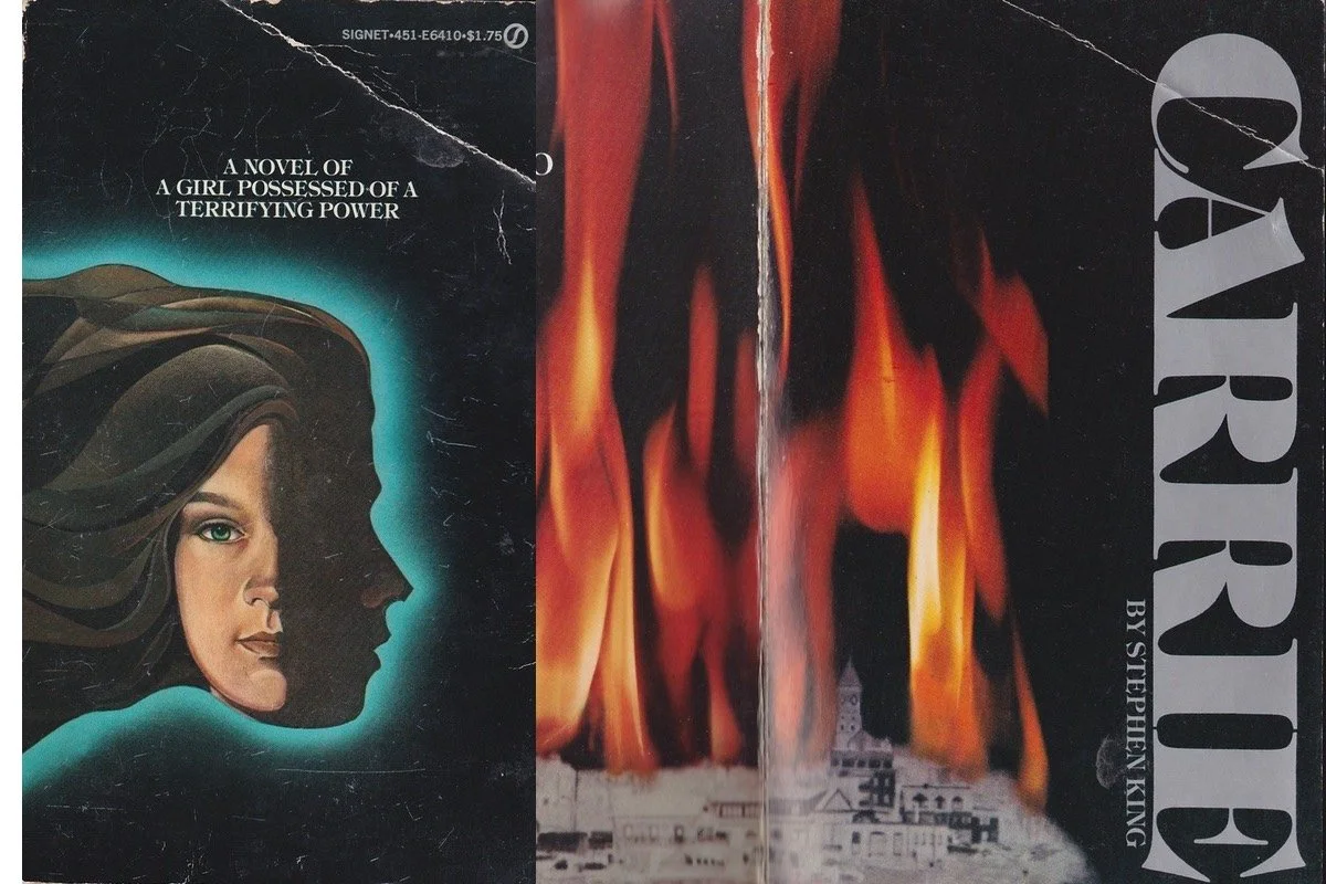
For Carrie he stuck with the girl’s face but planned to cut the cover down the side to reveal a slice of the double-page stepback spread of a town in flames. The sliced piece of cover would also reveal the title and King’s name. Unfortunately, by the time the printer realized he couldn’t make the slice work it was too late to change the cover so they had to publish it without the title or King’s name on the cover. For ‘Salem’s Lot Plumieri decided to do it on purpose. When he brought King in to the office for a cover reveal, King uneasily joked that he’d be fine with anything “as long as it had my name on it this time.” Plumieri and NAL’s president, Herb Schnall, exchanged a look and revealed the cover. It was black. Just black. If you looked closely you saw a drawing of a woman done in black over the black background with a single red drop of blood trickling out of her lips. He didn’t put King’s name or the title of the book on the cover because he believed readers would go, “What the hell?” and pick it up, turn it over, and then read all about it and now that it was in their hot little hand you were that much closer to a sale.
The result, however, was the opposite. Confused bookstore clerks stocked the book backwards so the back jacket copy faced out. No one picked it up. Someone hit the emergency brakes and within a couple of weeks they rushed out a new edition with King’s name and ‘Salem’s Lot on the cover. It sold 2.25 million copies in its first year. The Shining? 2.3 million copies in its first year. Then Plumieri hired Don Brautigam to do the cover for Night Shift a book Doubleday hadn’t even bothered to design a cover for. After that, Brautigam did the paperback cover of The Stand for which he won “Cover of the Year.”
Doubleday may have recognized King’s talent, but it was NAL that turned him into a blockbuster author. More specifically, it was Jim Plumieri.